Theming
Themes are data: palettes for light and dark mode, typography, border radius, drawer width and app bar height, shadows, logo, custom CSS, and the app's own options. Seven built-in themes ship with the package (Ocean, the default, Coworkee, Classic, Forest, Midnight, Sunset and High Contrast); they differ in fonts, radius, navigation width and behaviour, not only in colors.
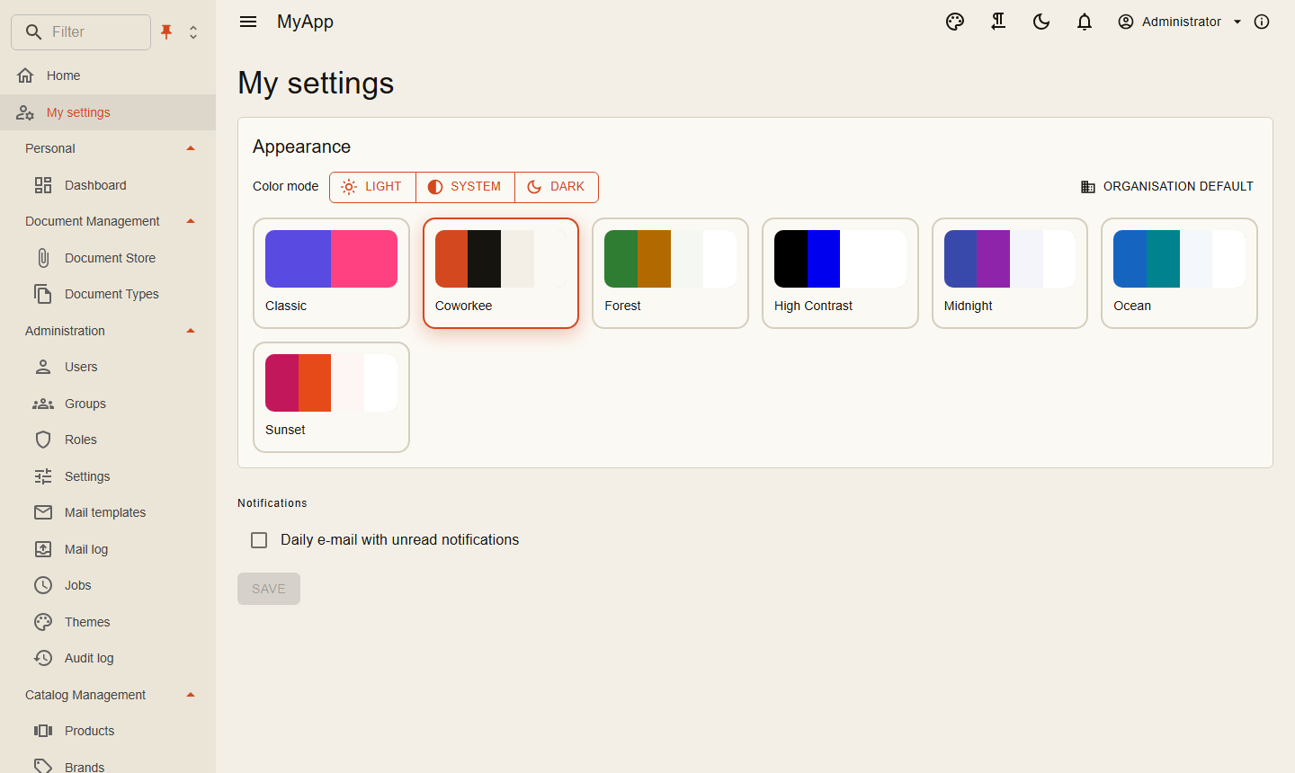
- Administration > Themes (
Themes.Manage) shows a tile per theme: light and dark colors, name, published state, Edit, Make default and Delete (own themes only, after a confirmation). Edit and New theme open aMudExThemeEdit<CoworkeeTheme>with a live preview; a new theme starts from one of the existing themes. Built-in themes stay read-only, saving one creates a copy. - Everyone can choose the built-in themes and the published ones; the tenant default applies until a user picks another theme (and light, dark or system mode) in the account settings or from the palette in the app bar.
CoworkeeThemederives fromMudThemeand adds:ShowLogoInNav,ShowLogoInAppBar,ShowNavFilter,CanPinNav,CanChangeNavExpandMode,NavSingleExpand(until the user chooses),Dense,StripedTables,IsPublished,LogoSvg,CustomCss. All of them are fields in the editor.CustomCssis a stylesheet for the whole app (rendered after the theme), edited in a growing multiline field.Dense(on by default) makes the whole UI compact: tables, lists, menus, tree views, alerts, expansion panels and checkboxes renderDense, inputs and selects useMargin.Dense, chipsSize.Small. Forms (MudExObjectEdit) and the navigation menu keep their normal size. Themes saved with the formerDenseTablesoption keep their value.- The library's components inherit
CoworkeeComponentBase, which receives the theme'sDensityas cascading value (Density.Dense,Density.Margin,Density.Size). Own components can do the same:@inherits CoworkeeComponentBaseor[CascadingParameter] Density Density { get; set; } = Density.Default;. A model's ownIObjectMetaConfiguration<T>replaces the dense object edit configuration for that model. - Without a theme logo the app's own logo shows:
options.AppLogo = "logo.svg"inAddCoworkeeClient. - Setup offers the theme as one of its steps.
- The auth server's account pages follow the default theme's colors, font and logo. Their layout and media are one setting for the whole installation: the card Sign-in page at the top of Administration > Themes, see Sign-in pages and designs.
- The theme editor's fields come from MudEx object edit metadata. The library registers
CoworkeeThemeEditMetaasIObjectMetaConfiguration<CoworkeeTheme>(theCustomCssfield); register your own afterAddCoworkeeClientto render fields differently (it replaces the library's):
builder.Services.AddScoped<IObjectMetaConfiguration<CoworkeeTheme>, MyThemeEditMeta>();

public sealed class MyThemeEditMeta : IObjectMetaConfiguration<CoworkeeTheme>
{
    public Task ConfigureAsync(ObjectEditMeta<CoworkeeTheme> meta)
    {
        meta.Property(t => t.LogoSvg).WithLabel("Logo (SVG markup)");
        return Task.CompletedTask;
    }
}
ThemeService in the client applies a theme at runtime (Apply, Preview, SetMode).
Default theme and app themes
ThemingOptions picks the default theme of the installation and adds themes of the app. An app theme is a built-in theme with other colors; it is seeded and kept like the built-in ones (read-only in the app, offered in setup). A changed Primary or Secondary gets a readable contrast text unless the palette names one.
context.Services.Configure<ThemingOptions>(themes =>
{
    themes.DefaultTheme = "Shop";
    themes.Themes.Add(new AppTheme("Shop", "Ocean", new Dictionary<string, string> { ["Primary"] = "#0a7d5a", ["Secondary"] = "#ff8f00" }));
});
An unknown DefaultTheme keeps Ocean. An app theme with the name of a built-in or another app theme, or based on an unknown theme, stops the host at start with a message. The default applies until an organisation chooses its own theme (setup or Make default). coworkee new --theme Forest --primary-color "#0a7d5a" writes this for you.