Data tables
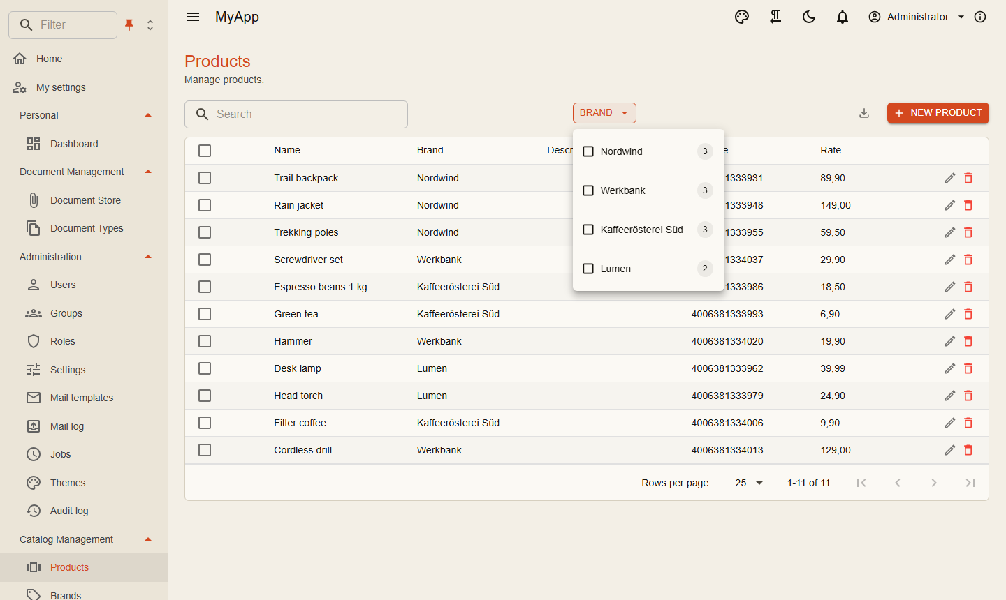
CoworkeeDataTable<T> is a MudBlazor data grid on top of an OData set. The server pages, sorts, filters and counts; the table adds search, facets, export, selection and the create, edit and delete buttons with their permissions.
<CoworkeeDataTable T="ProductDto" EntitySet="Products" Expand="Brand" SearchFields="SearchFields" MultiSelection="true" ExportFileName="products"
                   CreatePermission="@CatalogPermissions.Products.Create" EditPermission="@CatalogPermissions.Products.Edit" DeletePermission="@CatalogPermissions.Products.Delete"
                   OnCreate="CreateAsync" OnEdit="EditAsync" OnDelete="DeleteAsync" DescribeItem="p => p.Name">
    <Columns>
        <PropertyColumn Property="p => p.Name" />
        <PropertyColumn Property="p => p.Brand!.Name" Title="Brand" />
        <PropertyColumn Property="p => p.Rate" Format="0.00" />
    </Columns>
</CoworkeeDataTable>
| Parameter | |
|---|---|
EntitySet |
name of the OData set |
Columns |
MudBlazor columns; nested properties sort as Brand/Name |
Expand |
navigation properties to load, e.g. "Brand" |
Filter |
a fixed OData filter on top of the user's choices |
SearchFields |
properties the search box looks in (case insensitive contains) |
Facets |
show the facet menus (default true) |
MultiSelection |
check boxes and a Delete n button |
OnCreate, OnEdit, OnDelete |
callbacks; the table reloads after each of them |
CreatePermission, EditPermission, DeletePermission |
hide the buttons without the permission |
DescribeItem |
text for the delete confirmation |
Exportable, ExportFileName |
CSV and JSON export of all rows of the current filter |
ToolBarContent |
extra buttons in the tool bar |
PageSize |
rows per page (25) |
Groupable, ReorderableColumns, ResizableColumns, DensityToggle |
grouping, moving columns by drag and drop, resizing columns and the density button (all true) |
DataSource |
rows from somewhere else than the OData set, see below |
ColumnFilters |
a filter in every column header, see column filters (default options.DataTable.ColumnFilters, true) |
FacetLayout |
Bar (pills above the rows, default) or Panel (a side panel with every facet open), see facets |
FacetSettings |
the page's say per facet: view, any of / all of, exclusion, hiding |
AdvancedFilter |
the Advanced filter button with the query builder (default options.DataTable.AdvancedFilter, true) |
QueryFields |
the fields of the query builder; by default the property columns and the reference facets |
The table reloads by itself when its [Realtime] entity changes (RealtimeTopic, see Realtime). ReloadAsync() reloads from outside, for example from a RealtimeSubscription. Selection exposes the facet choices, CurrentFilter the OData filter the table sends (fixed filter, facets, column filters and search).
For sets marked as client entities the table filters, searches, sorts and counts in the browser once the rows arrived.
The CSV export escapes values that spreadsheet programs would run as formulas.
Facets
Facets come from the server ([ProvideFacet] on the entity, see OData and facets) with their values, counts and the OData filter of each value. The table shows each facet in a view that fits its values:
| View | for | default for |
|---|---|---|
Checkbox |
a list with counts, a search above long lists and show more | text and references |
Chips |
chips with counts | enums and flags with up to 8 values |
Select |
a dropdown, compact for long lists | |
Buttons |
a segmented row, All in front for a single choice | radio facets with up to 4 values |
Swatches |
colored dots, the color from [FacetColor], a color meta value or the value itself |
|
Tree |
values split at a separator ("image/png" below "image") | |
Toggle |
all, yes or no | bool |
Range |
a histogram over a slider with from and to fields | numbers with FacetType.Range |
Dates |
presets (today, this week, last 30 days, ...), a histogram of days, months or years and a custom range | dates |
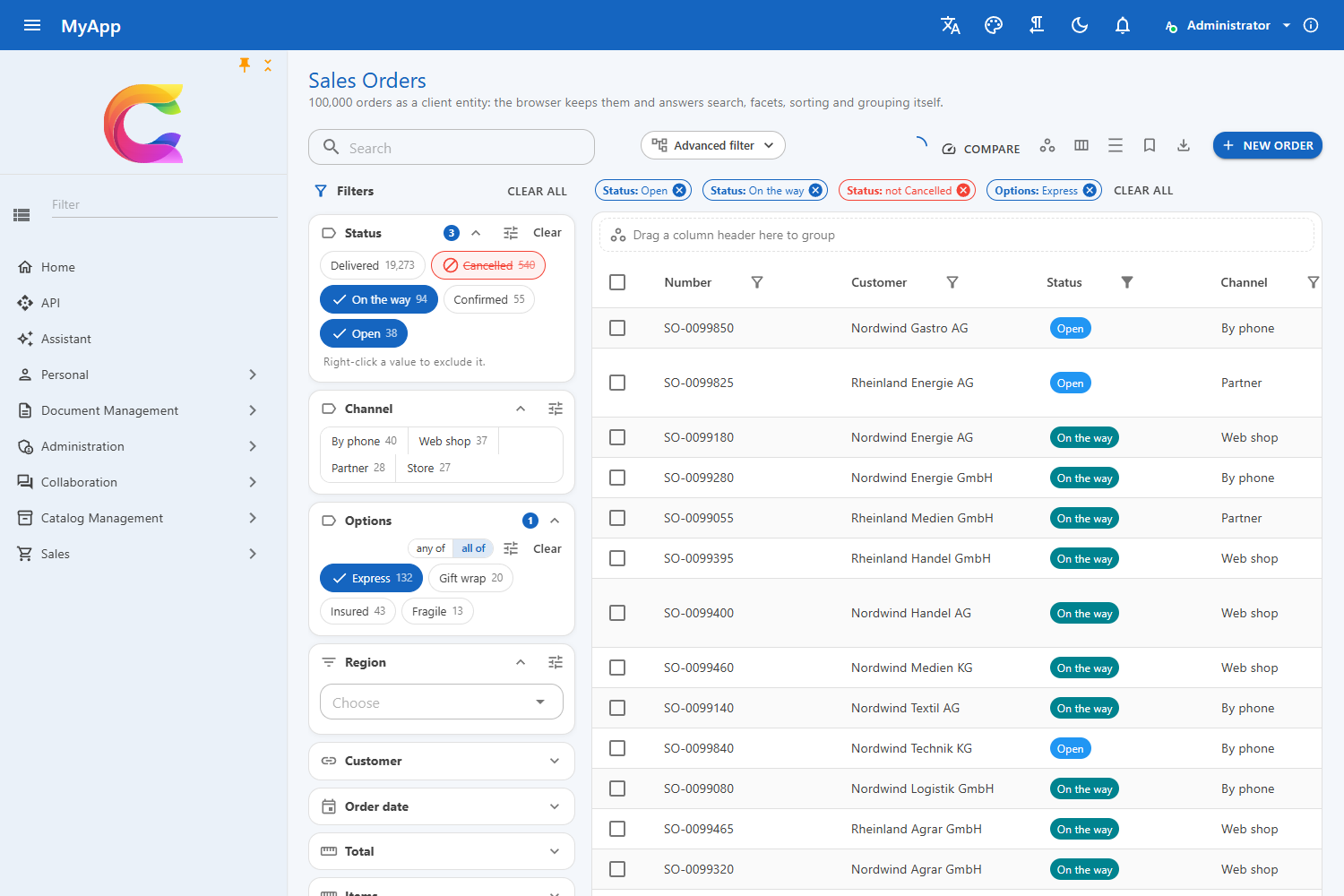
Enum values show their [Display(Name)], else their [Description], else the member name in words (InTransit reads In transit), translated like every other text. The URL, saved views and the OData filter keep the member name, so a new label never breaks a link.
How values combine
FacetCombine |
meaning | OData |
|---|---|---|
Any (default) |
rows with any of the chosen values | (Status eq 'Open' or Status eq 'Shipped') |
All |
rows with all chosen values, for values that can hold together such as [Flags] enums |
(Options has 'Express' and Options has 'Insured') |
Single |
one value at a time | Color eq 'Red' |
With AllowExclude a value can also be excluded: the ⊘ button in lists, a right click on chips. Excluded values join with not: (Status eq 'Open' and not (Status eq 'Cancelled')). Groups always join with and.
Counts follow the other choices but leave a group's own choice out, the way shop filters do: after picking Open, Shipped still shows how many rows it would add. The table sends the choice apart from the rest of the filter in the Coworkee-Facets header; client entities count the same way in the browser. All of groups count with their own choice, since every further value narrows.
Configuring a facet
On the server, next to [ProvideFacet]:
[ProvideFacet(Label = "Status")]
[FacetBehavior(View = FacetView.Chips, AllowExclude = true, Switchable = true)]
public SalesOrderStatus Status { get; set; }

[ProvideFacet(Label = "Options")]
[FacetBehavior(Combine = FacetCombine.All, Switchable = true)]
public SalesOrderOptions Options { get; set; }   // [Flags] enum: each flag is a value

[ProvideFacet(Label = "Total", Type = FacetType.Range)]
[FacetBehavior(Buckets = 16)]
public decimal Total { get; set; }
or without touching the entity:
services.ConfigureFacet<SalesOrder>(o => o.Region, f => { f.View = FacetView.Select; f.AllowExclude = true; });
Switchable lets users switch between any of and all of (where values can hold together) and between the views that fit (the tune menu of a facet); their pick is part of saved views. Unset, MultiSelect = false on [ProvideFacet] means Single and GroupOperator = And means All.
The page has the last word:
<CoworkeeDataTable T="SalesOrderDto" EntitySet="SalesOrders" FacetLayout="FacetLayout.Panel" FacetSettings="FacetSettings" ...>

@code {
    private static readonly Dictionary<string, FacetSettings> FacetSettings = new()
    {
        ["region"] = new() { View = FacetView.Select, AllowExclude = true },
        ["customer"] = new() { Hidden = true },
    };
}
Keys are the facet keys: the property name in camel case (orderDate).
Ranges: number facets with FacetType.Range and date facets get their smallest and largest value and a histogram whose buckets are options with their own filter, so client entities recount them locally. The chosen range is one value, (Total ge 40 and Total le 100). Date presets stay relative: a saved view with last 7 days means the last 7 days whenever it opens.
Facets elsewhere
The facet components work without the table, e.g. beside a chart or in a report:
<FacetPanel Groups="_groups" Selection="_selection" />           @* or <FacetBar ... /> *@

@code {
    private readonly FacetSelection _selection = new();
    private IReadOnlyList<FacetGroupDto> _groups = [];

    protected override async Task OnInitializedAsync()
    {
        _selection.Changed += () => InvokeAsync(LoadAsync);
        await LoadAsync();
    }

    private async Task LoadAsync()
    {
        var page = await OData.QueryAsync<OrderDto>("SalesOrders", new ODataQuery
        {
            Filter = _selection.ToFilter(), Top = 0, Facets = true, FacetContext = _selection.Context(null, _groups),
        });
        _groups = page.Facets;
        StateHasChanged();
    }
}
FacetGroupView shows one group (render FacetStyles once), FacetSelection holds the choice and writes the OData filter (ToFilter(), GroupFilter(key)), Facets.View(group) and Facets.Combine(group) tell what a group shows and how it combines.
Column filters
Like in QuickGrid every column can be filtered: the filter icon in the header (or Filter in the column menu) opens a small editor that fits the column's type. A filled icon shows that the column is filtered, and every filter appears as a chip above the table; its × removes it, Clear all removes filters and facets together.
| Column type | Editor | OData |
|---|---|---|
| text | contains, starts with, equals and a value | contains(tolower(Name),'dri'), startswith(...), Name eq 'Drill' |
| numbers | =, >, <, between | Rate gt 3, Rate ge 3 and Rate le 10 |
| dates | is, after, before, between (whole days) | Added ge 2026-02-01T00:00:00+01:00 and Added lt ... |
| enums, yes/no | check boxes, several are alternatives | (Kind eq 'Hand' or Kind eq 'Power') |
| a column with a facet | the facet's options with their counts | the facet's own filter |
Facets and column filters are one thing. When the set has a facet on the column's property, the column filter shows that facet's options and counts, and ticking one there or in the facet menu is the same choice (same chip, same URL). A column on a navigation property uses the facet of its key: Brand.Name uses a facet on BrandId.
The filters join the table's OData filter with and, so the server answers them, and so does the browser for client entities: they only use what both understand (eq, ne, gt, ge, lt, le, and, or, not, contains, startswith, endswith, tolower). They belong to the table's state: saved views, shared links and the address bar keep them.
Turning them off and on
Column filters are on by default. Each level can change that:
@* the whole table *@
<CoworkeeDataTable T="ProductDto" EntitySet="Products" ColumnFilters="false" ...>
    <Columns>
        @* only this column, although the table has them off *@
        <PropertyColumn Property="p => p.Name" Filterable="true" />
        @* never this column *@
        <PropertyColumn Property="p => p.Description" Filterable="false" />
        @* only some operators *@
        <PropertyColumn Property="p => p.Barcode" FilterOperators="@(new() { FilterOperator.String.Equal })" />
    </Columns>
</CoworkeeDataTable>
Template columns have no property and are not filterable. For the whole app, per type:
builder.Services.AddCoworkeeClient(new Uri(builder.HostEnvironment.BaseAddress), options =>
{
    options.DataTable.ColumnFilters = true;   // default of every table
    options.DataTable.FilterOperators<DateTime>(FilterOperator.DateTime.After, FilterOperator.DateTime.Before, DataTableFilters.Between);
    options.DataTable.FilterOperators<Guid>(); // no operators: Guid columns are not filterable
});
The order is: the column's Filterable/FilterOperators, then the options for the type, then the defaults above.
Your own editor
FilterTemplate on a column replaces the editor. It gets MudBlazor's FilterContext; add filter definitions with the column and one of MudBlazor's FilterOperators and the table turns them into OData:
<PropertyColumn Property="p => p.Rate" Title="Rate">
    <FilterTemplate>
        <MudButton OnClick="@(() => context.Actions.ApplyFilterAsync(new FilterDefinition<ProductDto>
            { Id = Guid.NewGuid(), Column = context.FilterDefinition!.Column, Operator = FilterOperator.Number.GreaterThanOrEqual, Value = 4m }))">
            Rate 4 and up
        </MudButton>
    </FilterTemplate>
</PropertyColumn>
DataTableFilters.ToOData(...) turns such conditions into OData text yourself, e.g. for an ITableDataSource.
Limits: one editor per column (two filters for between); the filter applies to the property of the column, not to what a CellTemplate shows. Dates are filtered by whole days in the browser's time zone.
Advanced filter
Advanced filter opens the query builder above the rows: nested all / any groups of conditions on every property column, with operators and value editors that fit the type (enum values as choices, dates with today, this week or in the last n days, lists for is any of). The table joins its OData with the other filters, shows it as a chip and keeps it in the URL, saved views and shared links.
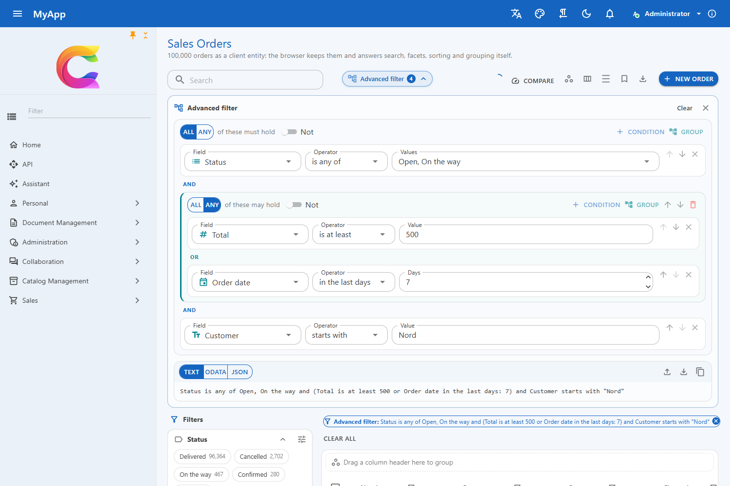
The fields are the property columns plus every reference facet that is no column (e.g. Customer as a choice of its facet values). QueryFields replaces them, for example to add a lookup that searches a referenced set:
<CoworkeeDataTable T="SalesOrderDto" EntitySet="SalesOrders" QueryFields="Fields" ...>

@code {
    private IReadOnlyList<QueryField> Fields => [
        new("Number", L["Number"], QueryFieldType.Text),
        new("Total", L["Total"], QueryFieldType.Number),
        new("CustomerId", L["Customer"], QueryFieldType.Guid) { Lookup = SearchCustomersAsync },
    ];
}
Advanced exposes the query (a QueryGroup); options.DataTable.AdvancedFilter = false hides the button in every table.
Edit dialogs
For plain models a generated dialog is enough:
if (await Dialogs.ShowEditAsync("Edit brand", model) is { } saved)
{
    await Snackbar.RunAsync(() => Api.SaveBrandAsync(id, saved), "Brand saved");
}
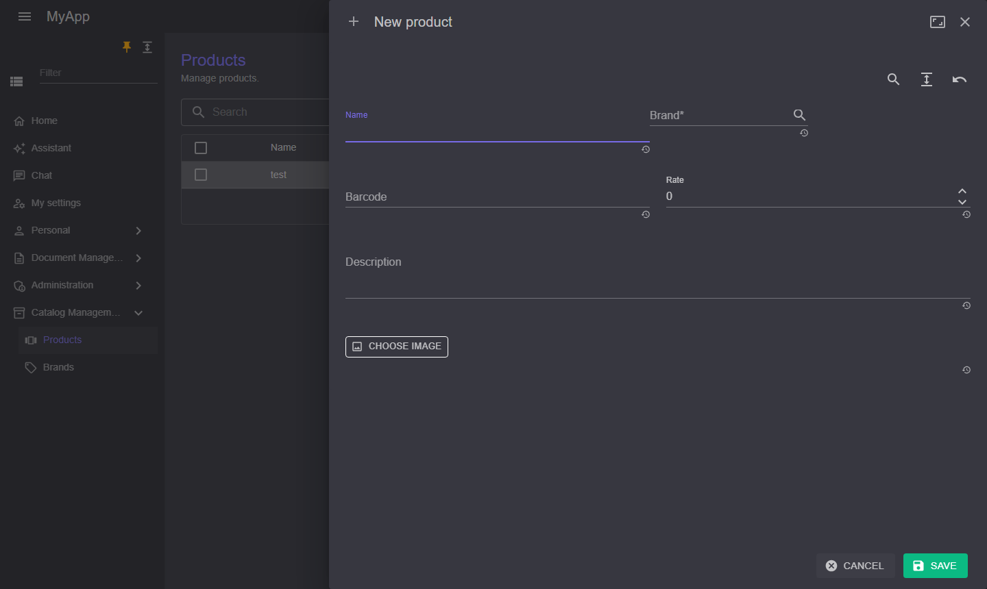
Edit dialogs are full height side sheets that slide in from the side the user clicked on, with two columns on wide screens.
 Pass
Pass meta => ... to configure the MudExObjectEditForm (labels, order, editors). With a save function the dialog stays open and shows the messages of the API when saving fails:
await Dialogs.ShowEditAsync(L["New product"], model, saved => Api.SaveProductAsync(id, saved), meta =>
{
    meta.Property(p => p.BrandId).WithLabel(L["Brand"])
        .RenderWith<ODataPicker, Guid>(p => p.Value)
        .WithAdditionalAttribute(nameof(ODataPicker.EntitySet), "Brands");
    meta.Property(p => p.ImageDataUrl).WithLabel(L["Image"]).RenderWith<ImageDataUrlEdit, string?>(p => p.Value);
});
| Editor | for |
|---|---|
ODataPicker |
a foreign key: searches an OData entity set by a text property |
OptionalODataPicker |
an optional foreign key (Guid?): like ODataPicker, clearing it gives null |
ImageDataUrlEdit |
a picture kept as data URL |
ShowSideSheetAsync<TDialog> opens your own dialog component the same way, ConfirmAsync asks before something that cannot be undone.
Columns, grouping and views
Everything the user arranges is part of the table's state and can be saved, shared and reset.
- Columns: the column menu shows and hides columns (with All, None and a search) and reorders them by drag and drop. Column headers can be dragged to another place too, and their right edge resizes the column.
- Grouping: drag a column header onto the zone above the headers, use Group in the column's own menu or tick columns in the group menu. Several columns group nested, in the order of the chips; a chip's × removes its level. Group rows show the value and the number of rows, open and close one by one or all at once, and show the aggregates of the columns (
AggregateDefinition, e.g. an average) below each group. - Sorting: click several headers to sort by more than one column.
- Density: the density button switches between compact and comfortable rows; without a choice the theme decides.
- Views: the bookmark menu saves the current state under a name: search, facets (with the views users picked), column filters, the advanced filter, column order, visibility and widths, grouping, sorting, page size and density. A click brings it back, the save button overwrites it with the current state, the star makes it the default that opens with the table. Reset returns to the declared columns without filters.
- Sharing: the link button copies an address that opens the table exactly as it is, layout included. The address bar itself keeps search, facets, column filters and the advanced filter (
?products=...), so a filtered list can be reloaded and bookmarked.UrlState="false"turns that off,StateKeynames the parameter when a page shows two tables of one set.
<CoworkeeDataTable T="ProductDto" EntitySet="Products" Expand="Brand" ...>
    <Columns>
        <PropertyColumn Property="p => p.Name" />
        <PropertyColumn Property="p => p.Brand!.Name" Title="Brand" />
        <PropertyColumn Property="p => p.Rate" Format="0.00" AggregateDefinition="AverageRate" />
    </Columns>
</CoworkeeDataTable>

@code {
    private static readonly AggregateDefinition<ProductDto> AverageRate = new() { Type = AggregateType.Avg, DisplayFormat = "Ø {value}", NumberFormat = "0.00" };
}
Columns are named by their property (Brand.Name), template columns by their Title; columns without either (select, actions) stay where they are. Template columns only group with Groupable="true" and a GroupBy.
Grouping and paging: the server pages, so a page groups the rows it holds. The table sorts by the grouping columns first, so a group continues on the next page instead of being scattered; group counts and aggregates cover the loaded page.
Where views are kept: in the user setting Table.Views of the settings module, so they follow the user to every device. Without a signed-in user or without the settings module they stay in the browser's local storage. Replace ITableViewStore in DI to keep them somewhere else:
CurrentState returns the state as a DataTableState (only what differs from the declared layout), e.g. to build your own links; DataTableState.Encode() gives the value for the query parameter.
Other data sources
By default the table queries EntitySet through OData. DataSource takes any ITableDataSource<T> instead, for example rows kept in the browser:
public sealed class LocalProducts(ProductStore store) : ITableDataSource<ProductDto>
{
    public Task<ODataPage<ProductDto>> QueryAsync(ODataQuery query, CancellationToken cancellationToken = default) =>
        Task.FromResult(store.Query(query));
}
The query carries the OData text the table builds (filter from search and facets, order, Top/Skip), so the source answers that subset. EntitySet still names the views and the URL parameter. CSV and JSON export use the source; Excel export and import stay with OData sets.