Dashboards and reports
[DependsOn(typeof(CoworkeeReportingModule))]
public sealed class MyAppDatabaseModule : CoworkeeModule;

builder.Services.AddCoworkeeReporting(baseAddress, reports => reports
    .DrillDown("SalesOrders", "sales/orders"));
That is the setup (plus one migration for cw.Reports and cw.ReportFavorites). New apps from the template have it already, --reports is on by default. Users get pages under /reports where they build dashboards from the entity sets you registered for OData:
No second data model, no export job. Fields come from the EDM, so a property you hid from OData is not offered in a report either. Rows are the ones the OData list would return, with the tenant filter and every row filter applied, and a user who lacks the permission for one set sees an error on those widgets while the rest of the dashboard works.
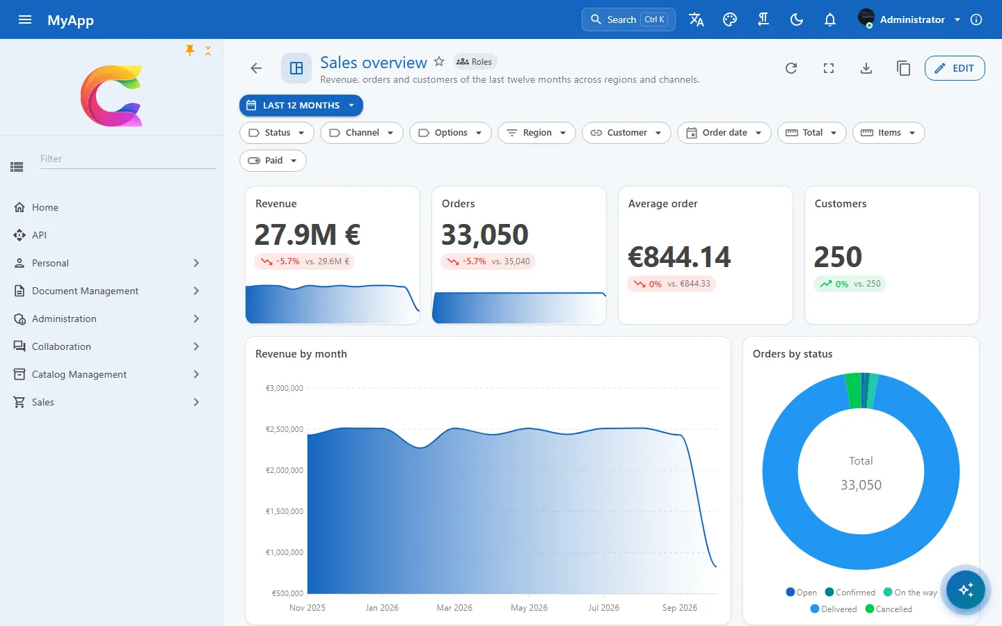
Aggregated in SQL
A widget sends a small query model to POST /api/v1/reports/query, never an expression:
{
  "entitySet": "SalesOrders",
  "filter": "Region eq 'Nord' and Total gt 100",
  "groupBy": { "field": "OrderDate", "bucket": "Month" },
  "aggregates": [ { "function": "Sum", "field": "Total" }, { "function": "Count" } ],
  "top": 10
}
The server checks each field against the source, builds GroupBy and Select as expression trees and leaves the SQL to EF Core, on PostgreSQL, SQL Server and SQLite alike. Up to two group fields (dates by day, week, month, quarter or year), up to 8 values from Count, Sum, Average, Min, Max and DistinctCount, at most 5,000 groups.
Measured on the demo's 100,000 sales orders (Postgres, warm): count by status 9 ms, sum by month 29 ms, count by week 55 ms, region by channel 23 ms, top 10 customers with join 30 ms, four KPI values 58 ms.
Status: reports have no version history, no public link and no map widget yet. On SQLite, date buckets on DateTimeOffset fields are rejected because EF stores them as text; DateTime and DateOnly work.
Designer, cross filter and drill-down
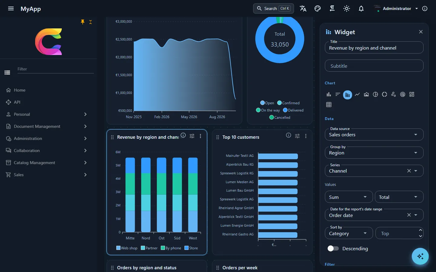
The grid is GridStack with 12 columns, one column on phones. In edit mode you drag widgets by the title, resize them at the edges and set up each one in the side panel; it redraws while you type. Undo covers everything until you save.
Widget types: KPI with trend and target, charts (bar, line, area, pie, donut, scatter, radar, treemap, heatmap and a few variants), a scrolling table, the full CoworkeeDataTable, a pivot, and Markdown, image or embedded page for the text around the numbers. Colours follow the MudBlazor theme, dark mode included.
Each group comes back from the server with an OData filter for exactly its rows. Click a bar or a pie slice and that filter narrows the other widgets on the same set; click Open the data and it lands on the page you registered with DrillDown, already filtered to the rows behind the number.
A report is private, shared with roles, or shared with the organisation (Reports.Share). Others can duplicate it, only the owner changes it, and a saved change reaches everyone who has it open. Export goes to PNG, PDF via the print dialog, or CSV and Excel per widget.
The sales report of the demo, step by step
The demo app comes with three reports. The pictures below are all from Sales overview, which reads the 100,000 sales orders.
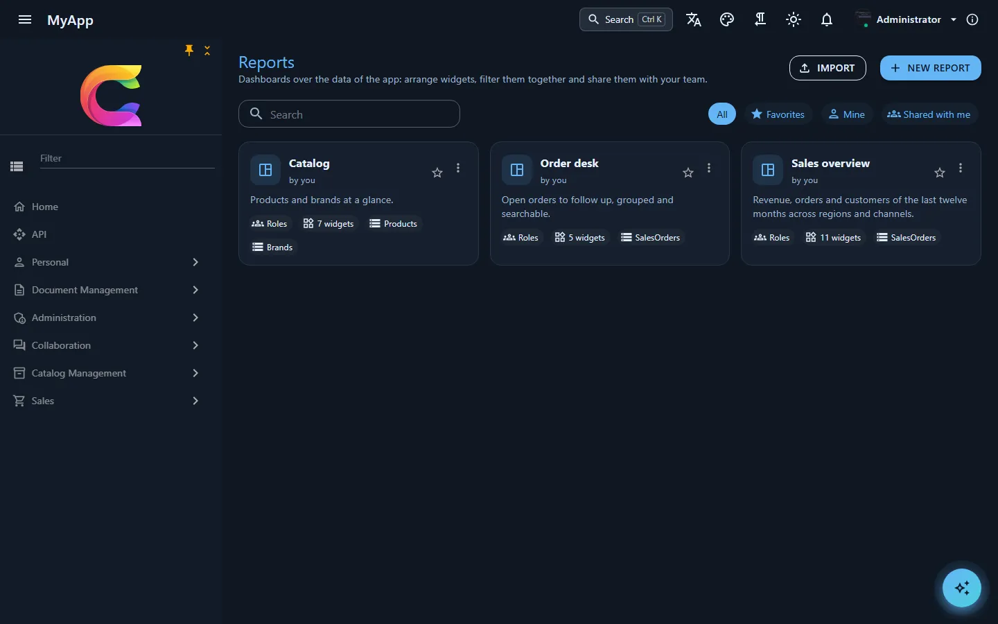
/reports lists every report the user may open. Each card says who made it, who it is shared with, how many widgets it has and which entity sets it reads. Import takes a report that was exported as JSON from another installation.
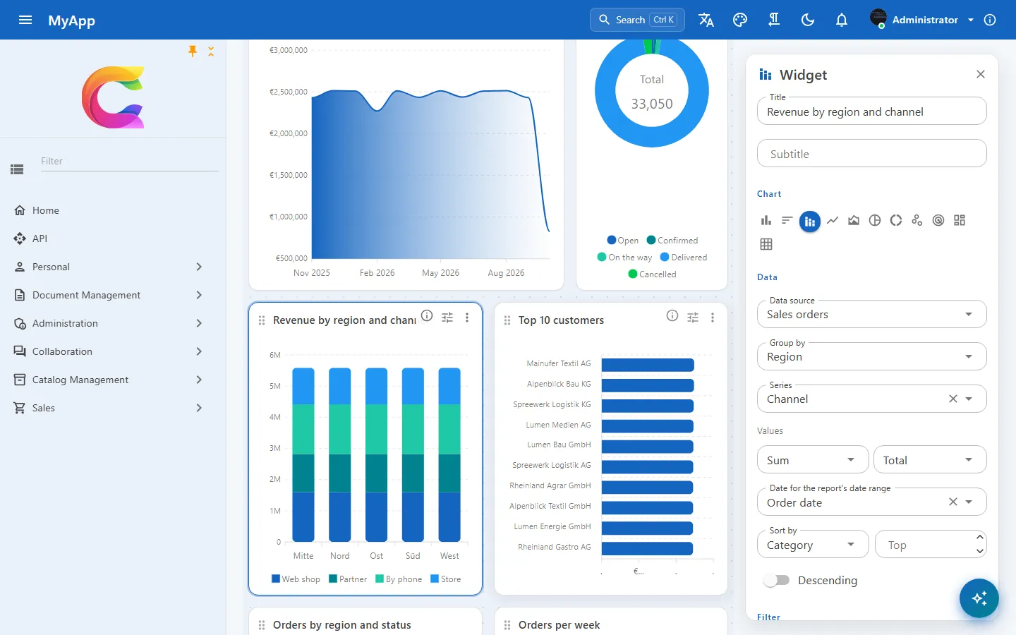
In edit mode every widget gets a grip to drag it and a settings button. The panel on the right is the whole definition of Revenue by region and channel: source Sales orders, grouped by region, one series per channel, the sum of Total, and the date field that the report's Last 12 months applies to. Pick another group field and the chart redraws right away; nothing is stored until Save.
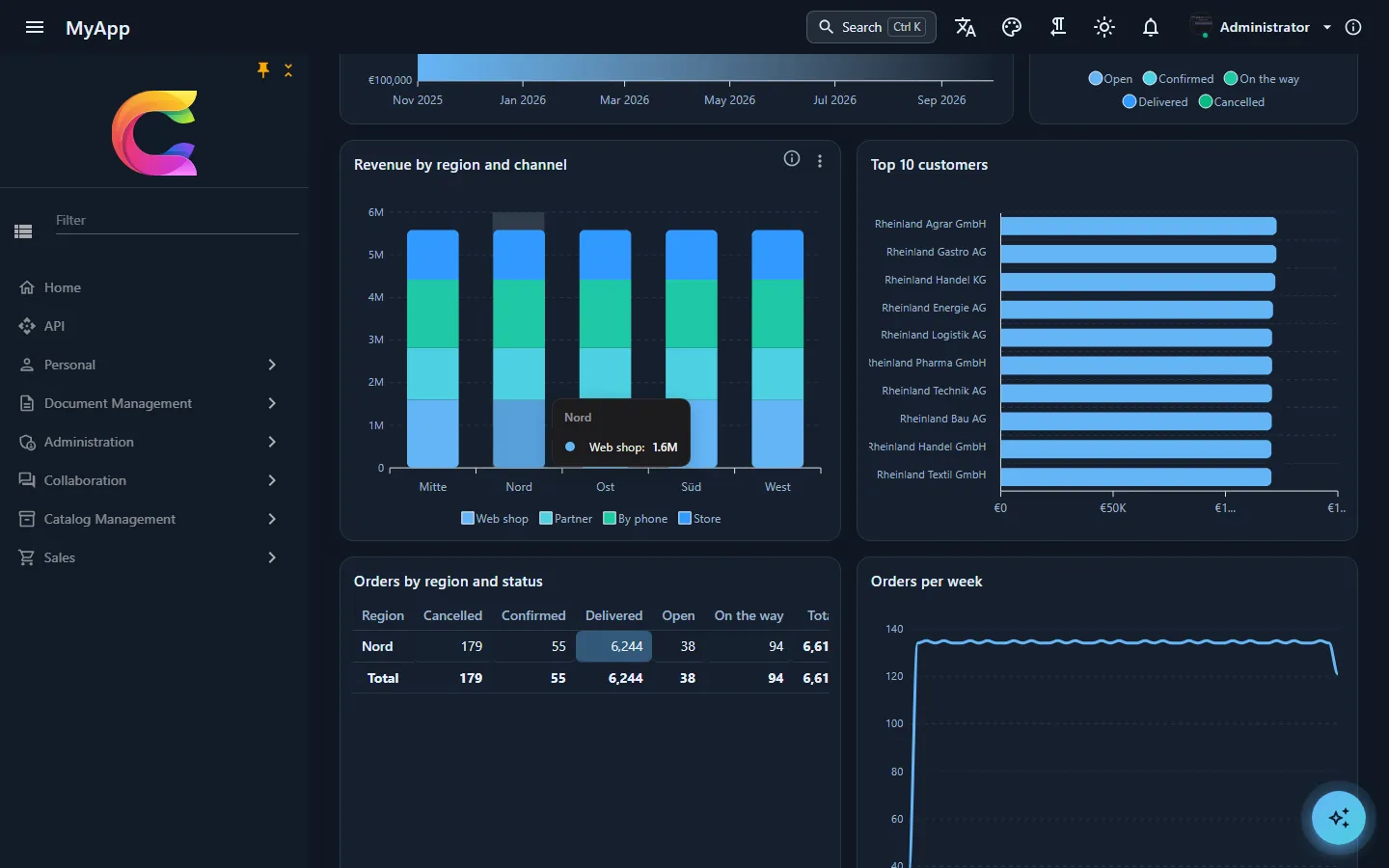
A click on the Nord bar. The pivot below keeps one row, the top 10 are now customers from Nord, and orders per week drop to around 130. A second click on the bar takes the filter away.
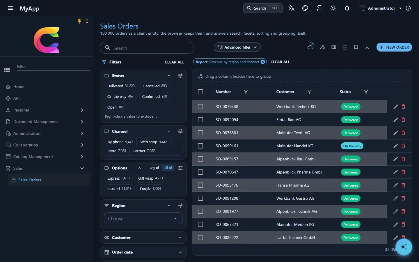
Open the data in the widget menu lands on the sales orders page. The chip Report: Revenue by region and channel carries the widget's filter, so the table and the facet counts on the left show the 33,050 orders of the last twelve months instead of all 100,000. Remove the chip to see everything again.
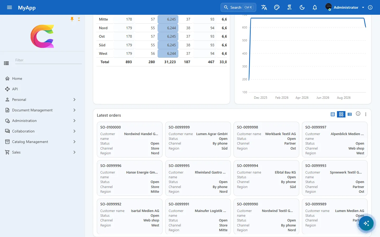
Latest orders is the same data table as on the list pages. The buttons in its header switch the view, here from rows to cards; sorting and columns work as on any other table.
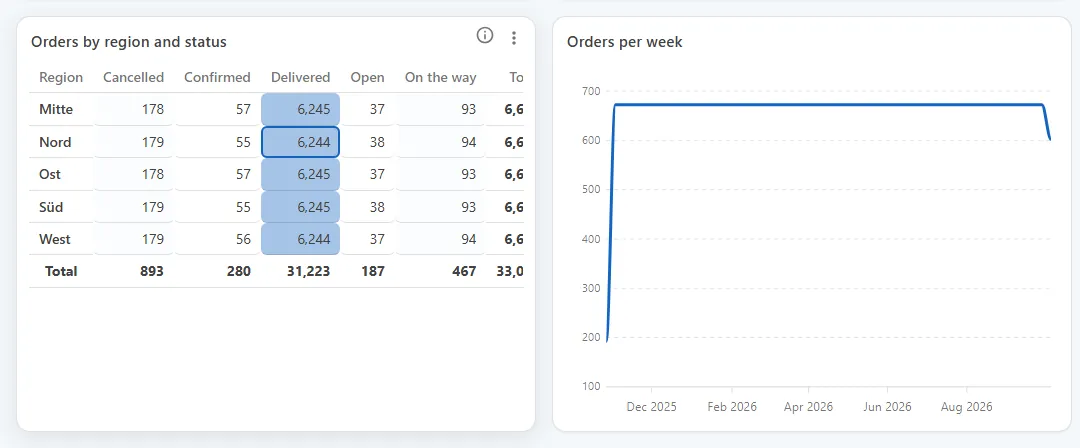
The pivot puts regions in rows and statuses in columns, with totals at the end of each row and column. The biggest values get a darker cell, which is why Delivered stands out.
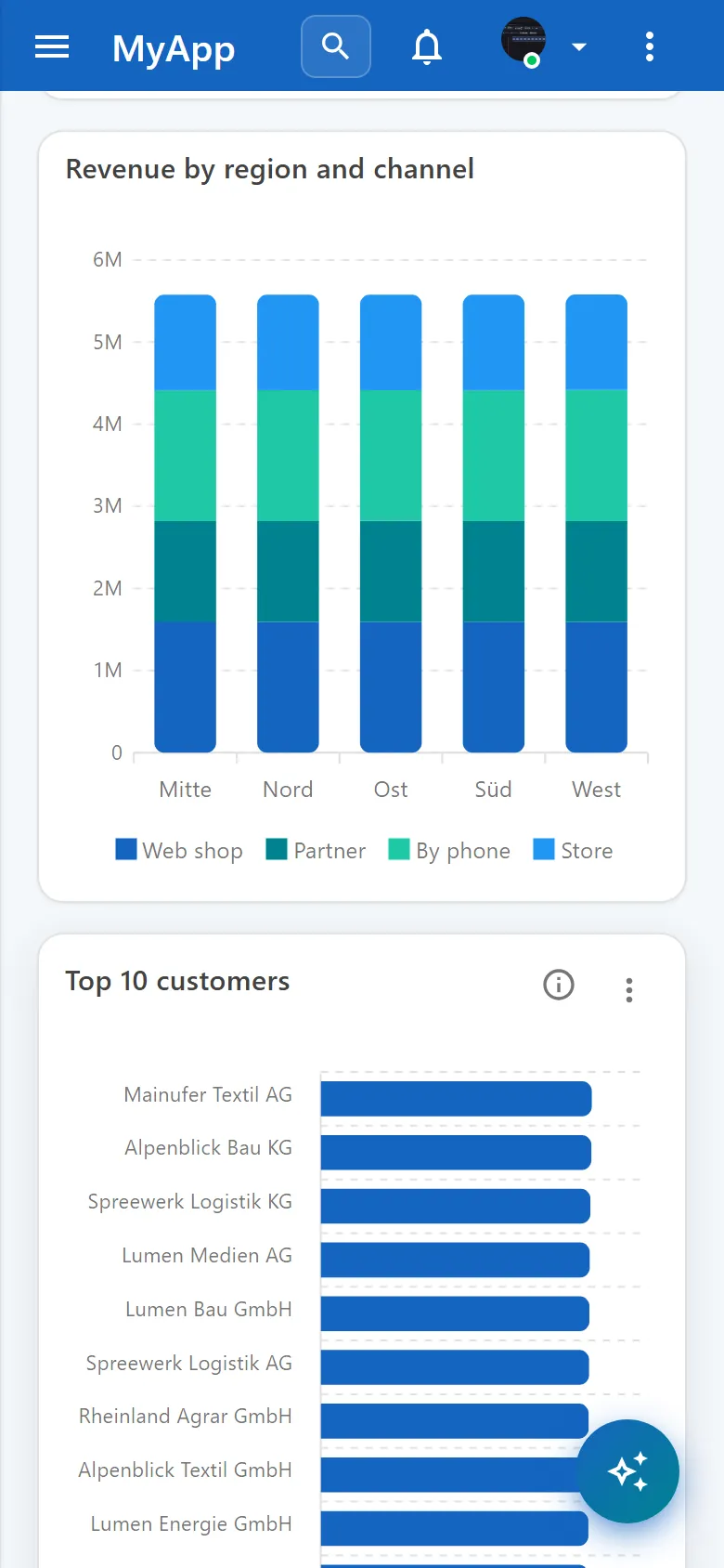
On a phone the grid has one column and the widgets follow the order of the desktop layout.
Reference: Reporting, OData, Query builder.